
06 / BRAND IDENTITY · LOGO DESIGN
Personalised Transport Solutions
A strong road identity with a personal name.
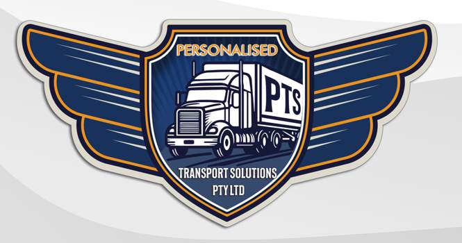
I designed the logo for Personalised Transport Solutions Pty Ltd. The artwork combines a prominent truck illustration, a PTS trailer wordmark and an extended winged shield.
LOGO DESIGN · RETROSPECTIVE NOTES
Original logo design. The notes below describe the visible artwork and possible extensions; they do not document a historical strategy study or business results.
01 / A READING OF THE ARTWORK
The visible design language.
01
Put transport at the centre
The truck occupies the centre of the emblem, making the transport focus explicit. The PTS initials sit on the trailer, integrating the name with the vehicle.
02
Build a horizontal silhouette
The central shield anchors the truck. Wide, layered wings extend the emblem horizontally.
03
Use contrast to define the mark
Deep navy anchors the artwork. White and warm off-white separate the vehicle and edges, while orange outlines and lettering add emphasis.
02 / POSSIBLE EXTENSIONS
Adapt the emblem for different sizes.
Use the full truck-and-winged-shield composition where detail can be retained, and explore a compact mark for small applications.
Possible identity extensions
For a practical identity system, retain the full emblem for large formats and explore a simplified truck-and-PTS mark for smaller uses. A single-colour version would support straightforward reproduction.
Proposed extensions for a future design pass.
03 / DESIGN DELIVERABLE