
COMPANY PROJECT · RADON
Swift Transport
From service
discovery
to enquiry.
A transport homepage organised around three services, real fleet photography and one clear next step.
Explore the redesignResponsive web design · Information hierarchy · AI-assisted interactive prototype
Original company project during my Radon tenure, August 2021–January 2025. The redesign shown here is an October 2026 portfolio refinement.
01 / THE BRIEF
Help visitors find
their next move.
The design challenge was to bring courier and taxi trucks, container transport, and warehousing into one readable homepage. Each service needs enough context to be understood, with a direct route to the appropriate enquiry contact.
Swift Transport was a Radon company project. The August 2021–January 2025 dates describe my employment at Radon, not the exact duration of this project.
The current October 2026 portfolio redesign explores a white-led editorial layout, navy structure and yellow calls to action. Existing Swift photography and the original logo keep the visual direction connected to the business.
The case shows the later portfolio redesign. Its service-finding and enquiry flow have not been validated with customers, and no launch or business results are attributed to this refinement.
02 / DESIGN DECISIONS
Make the offer visible.
Keep the next step specific.
Give the opening
a clear hierarchy.
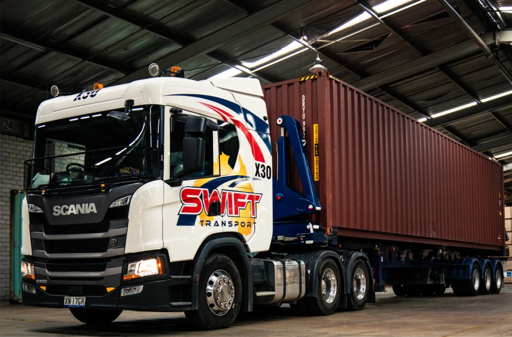
A short headline introduces the business. One yellow quote action stands apart from the quieter services link. The truck photograph gets its own panel rather than competing with the headline.
Trade-off: a large image adds presence, so the service index beside it provides a useful route forward.
Show all three
service chapters.
Couriers, containers and warehousing stay visible on the page. Each chapter pairs a plain-language description with supporting details and a service-specific enquiry link.
Trade-off: the page is longer, but core information does not depend on opening an accordion.
Carry the service
into the enquiry.
Choosing a chapter’s enquiry action selects the matching contact route. The yellow contact section makes the chosen service and published phone number explicit.
The preview links to Swift’s official contact page. It does not collect details or simulate a successful enquiry.
03 / THE REDESIGN
Explore the interactive redesign.
The latest visual direction is embedded below. Scroll through the page, select a service and try the enquiry choices.
04 / VISUAL SYSTEM
White space.
Navy structure.
Yellow emphasis.
White keeps the long page open. Navy anchors the service index and company story. Yellow marks the primary action and enquiry section. The original logo retains its existing red, blue and yellow.
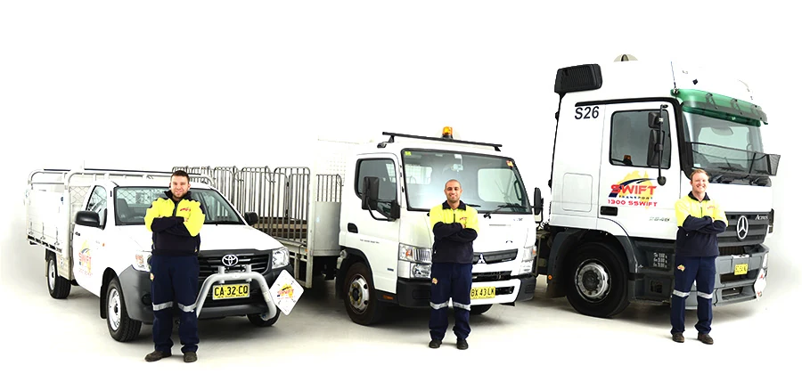
Manrope brings a consistent typographic voice. Fleet and warehouse photographs connect each service chapter to the business.
05 / REVIEW & NEXT STEPS
Check the behaviour.
Be precise about the evidence.
What the preview demonstrates
A responsive service-led homepage with a working navigation menu and service-specific enquiry choices. The next question to test is whether visitors can choose the right service and contact route.
Implementation checks and limits
Source checks cover local assets, image decoding, internal links, image text alternatives and source/output consistency. Thirteen isolated JavaScript checks exercise menu open/close, resize and return states, service selection, repeated clicks and keyboard-motion handling.
These automated checks use DOM-shaped test doubles. They are not user research, browser rendering tests or an accessibility audit.
What needs validation next
Review the desktop and phone layouts in a supported browser. Check image crops, keyboard and screen-reader navigation, native dialog focus, touch behaviour and the handoff to enquiry.
The implementation includes responsive breakpoints, visible focus, reduced-motion handling and a phone navigation dialog. The next review should follow a service-finding task from the homepage through to the intended contact route.
Photography and service references: Swift Transport’s official website ↗. Content used in this preview was checked on 11 October 2026.